Simplified a configuration menu
CrowdStrike, 2021
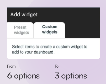
I simplified configuration options for cybersecurity specialists creating custom dashboard widgets.
Problem
Customers struggled to create a custom dashboard widget because the menu of options was too long, making it confusing to know where to start.
Solution
To simplify the user flow, I categorized the widget options with progressive disclosure in mind. As customers made decisions in one category, the options in the other categories dynamically changed to show only relevant options. I also added instructions and clarified the the meaning of the tab titles.
Result
Feedback revealed that customers no longer struggled to create the custom widgets on their dashboards.
Impact
The ease of creating custom widgets on dashboards continues to be a highly desirable feature for security experts using CrowdStrike’s products, as described in this CrowdStrike blog post video:
Endpoint Security – Customized Dashboards, May 2, 2024
(3:30 in video)
Lesson learned
Sometimes displaying all available options can overwhelm users, even if it has a simple look and feel.
The changes I made gave the menu a slightly busier and more condensed appearance than the more simple looking original design. This became a working example of how sometimes adding words and increasing the busy look and feel can improve the clarity and make a product more user-friendly.